USAA Mobile
- 4.7
- Rating
- 10.00M
- Installs
- Free
- Price

 Analysis by App-foxy
Managing money from a phone is only useful when the experience remains understandable under pressure. I looked at USAA Mobile with that in mind, focusing not just on what it can do, but on how comfortably different people can read, navigate, and complete everyday financial tasks. It is a free finance app from USAA that brings insurance, banking, and investment accounts into one mobile space. That combination makes it especially relevant for people who already use several USAA services and want one place to check them.
My overall impression is positive, but not uncritical. The app feels most valuable as a central dashboard for an existing USAA relationship rather than as a general-purpose banking app for everyone. It can reduce the need to move between separate tools, yet financial apps have a higher usability standard than ordinary lifestyle apps: a confusing label, a rushed confirmation, or a hard-to-read balance can have real consequences. I therefore paid close attention to clarity, control, and the situations in which the phone itself becomes the obstacle.
How the layout supports reading and navigation
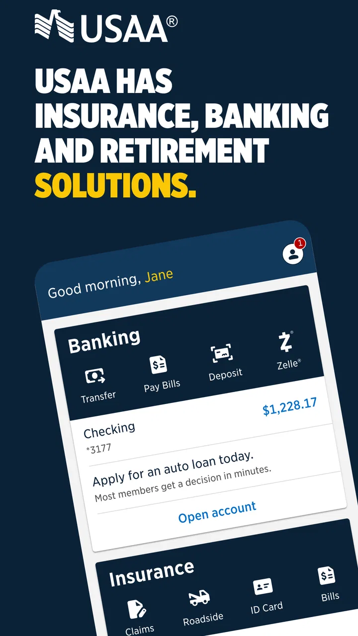
The strongest part of the experience is the way it gathers different financial areas under one account relationship. Instead of treating insurance, banking, and investments as unrelated products, USAA Mobile gives me a practical starting point for moving between them. That matters when I am checking a payment, reviewing a deposit, or trying to understand which part of my finances needs attention.
You May Also Like

 Blood Strike: 2.5 Anniversary
Blood Strike’s Loadouts Turn Every Drop Into a Tactical Gamble
A close look at Blood Strike’s custom loadouts: how fast access to signature weapons reshapes its battle royale rhythm, rewards preparation, and narrows the gap between fights.

 Pandora - Music & Podcasts
Pandora’s Music Is Easy to Start, but Harder to Recover
Pandora’s strength is its low-effort path from a seed to a station. Its weak spot is how much confidence it asks you to place in connection, setup, and quiet recovery.

 8 Ball Pool
 Is Built on Rivalries, Rematches, and Routine
A close look at the rivalries, rematches, shared routines, and unanswered safety questions that turn a quick pool match into a persistent mobile community.

 Samsung Music
’s Quiet Strength Is Playing What You Already Own
Its reach comes less from spectacle than from dependable access to a personal library. That simplicity is both the app’s strongest retention engine and its ceiling.

 AccuWeather: Weather Radar
AccuWeather Review: A Quick, Clear Forecast for Everyday Decisions
For everyday plans, the best forecast is the one you can understand quickly. AccuWeather makes rain timing, radar, and local conditions easy to act on, with a few trade-offs.

 Hill Climb Racing
Why Hill Climb Racing Still Turns Crashes Into One More Run
A tiny car, a bumpy hill and one more upgrade: Hill Climb Racing keeps resurfacing because its simple chaos makes every near-miss feel personal.
More From Our News Desk
View All News


For a person who already knows the USAA ecosystem, this unified approach can feel much less tiring than maintaining separate apps or repeatedly searching through a mobile browser. A single app also makes it easier to build a routine: open it, identify the account or policy area, complete the task, and leave. I find that kind of consistency more useful than a flashy interface.
The developer is USAA, and the app has reached a broad audience, with more than ten million installs. Its average rating is 4.7 from roughly 470,000 ratings, alongside about 65,000 written reviews. Those figures suggest that the overall experience works well for many people, although a high rating should never replace checking whether the navigation suits your own needs.
Readability is not only about font size. It also depends on whether labels make sense before I tap them, whether balances and transactions are visually separated, and whether the next step is obvious. In a finance app, I prefer screens that answer three questions quickly: what account or policy am I viewing, what has changed, and what action is available. USAA Mobile is at its best when it keeps that relationship between information and action clear.
A useful habit is to avoid opening the app with a vague goal such as “sort out my money.” I get better results when I decide whether I am checking a transaction, handling an insurance task, reviewing an investment account, or looking for a banking action. This is a small change, but it reduces wandering through menus and lowers the chance of selecting the wrong financial area.
Why the all-in-one approach helps some users
The app makes particular sense for someone whose daily life already involves several USAA products. A person might check a bank balance in the morning, review an insurance-related item later, and look at investments during a quieter moment. Having those services close together can reduce mental switching, which is an accessibility benefit in a practical, everyday sense even without any formal accessibility claim.
It is also helpful for users who dislike managing multiple passwords, app icons, and navigation patterns. The trade-off is that a broader app can feel busier than a focused banking tool. Someone who only wants a simple checking balance may prefer a narrower app whose entire structure is built around spending and deposits. USAA Mobile earns its place when the wider relationship is useful, not merely because it contains more sections.
When reviewing transactions, I recommend slowing down before confirming anything that moves money or changes an account setting. A quick glance is fine for awareness, but a deliberate second look is wiser for amounts, recipients, dates, and account destinations. The app’s convenience should not encourage hurried decisions, especially for users who read slowly, rely on magnification, or need more time to process financial information.
Navigation for different reading styles
People do not all scan screens in the same way. Some look for prominent headings, some search for familiar words, and others depend on a predictable sequence of controls. A good personal test is to repeat one common task on different days and notice where hesitation occurs. If I consistently pause at the same screen, that is a sign to use a slower workflow rather than assuming I will eventually remember it.
Users who benefit from larger text, stronger contrast, or screen-reading support should evaluate the current interface alongside the accessibility settings on their phone. Those operating-system tools can make a major difference, but their effectiveness depends on how the app presents its labels and controls. I would not assume that every screen will feel equally comfortable with magnification or spoken navigation; checking the tasks you actually perform is more reliable than judging the app from its opening screen.
Motor, sensory, and situational considerations
Financial tasks often happen when attention is divided. I may be standing in a queue, dealing with a child, travelling, or trying to confirm a payment before a deadline. In those moments, the app’s value depends on whether I can pause safely and return without losing track of what I was doing. A compact mobile workflow is convenient, but it also creates pressure to finish on a small screen.
For users with limited dexterity, the most important question is not simply whether buttons are visible. It is whether the entire sequence can be completed without precise tapping, rapid gestures, or repeated corrections. I would use a stable surface, increase the phone’s text size if needed, and avoid completing sensitive actions while walking or holding the device awkwardly. These choices reduce mistakes more effectively than trying to move quickly.
Users with tremors or reduced fine-motor control may find confirmation screens especially important. Rather than treating them as interruptions, I see them as opportunities to verify what will happen. Before submitting a transfer, payment, or account change, I would read the destination and amount aloud or compare them with the original note. That simple routine creates a second layer of protection when tapping accuracy is difficult.
For people with low vision, glare and lighting can matter as much as the interface itself. A bright outdoor screen, reflections, or a dim room can make figures harder to distinguish. I would avoid making a financial decision based on a quick glance in poor light. Turning the phone, adjusting system display settings, or waiting for a better viewing condition may feel slower, but it is a sensible trade-off for accuracy.
Users with hearing loss should not have to depend on sound alone to understand progress or errors. When using any financial app, I prefer visible confirmation and written status information, especially after a sensitive action. If a task appears uncertain, I would not repeat it immediately. I would first check the account activity or transaction history, because repeating a payment simply because an audio or visual response was missed can create a bigger problem.
A realistic everyday workflow
Imagine receiving a notification that a bill is due while you are away from home. I would open USAA Mobile, identify the relevant banking area, review the available balance, and check the payment details before proceeding. If I were distracted or using enlarged text, I would take a moment to confirm the amount and date rather than relying on memory. Afterward, I would look for a clear record of the action instead of assuming it completed.
This scenario shows both the strength and the limitation of mobile finance. The app can place an important task within reach, which is valuable for people who cannot easily visit a branch or work comfortably at a desktop. At the same time, a phone is easy to drop, difficult to read in glare, and vulnerable to interruptions. The best workflow is not necessarily the fastest one; it is the one that leaves a clear trail and gives me confidence that I did the right thing.
Another useful scenario involves someone managing insurance and banking together after a move or during a busy period. A unified app can reduce the effort of switching contexts, especially when the person needs to review several parts of the relationship. However, combining tasks in one session can also increase cognitive load. I would finish one action completely, verify its result, and only then move to another area rather than keeping several unfinished tasks open in my head.
Access when circumstances change
Situational access deserves as much attention as permanent disability. A user with a temporary injury, a migraine, poor connectivity, wet hands, or limited privacy may interact with the app very differently from a person sitting comfortably at home. USAA Mobile is most useful when it supports short, focused checks, but I would avoid starting a complicated financial task in a place where I cannot concentrate or protect private information.
Travellers and people with demanding schedules may appreciate having banking, insurance, and investment information available through one mobile entry point. The practical advantage is reduced dependence on a computer. The practical risk is that a phone screen can encourage decisions made in unsuitable surroundings. I would prepare important details beforehand, use a secure environment, and leave complex reviews for a time when I can read every screen carefully.
For users who share devices or need assistance from a caregiver, privacy and independence become closely connected. A helper may make tapping easier, but financial information should not become casually visible. I would keep the device locked, avoid handing it over unnecessarily, and make sure the account holder remains involved in reviewing amounts and destinations. The app can support access, but it cannot replace a safe personal process.
Where the experience may still create friction
The broad scope that makes USAA Mobile convenient can also make it less immediately simple. Banking, insurance, and investments involve different vocabulary and different decisions. A user who is comfortable with checking accounts may feel less confident when moving into insurance or investing screens. I would not treat the presence of all these services as proof that every section will be equally easy to understand.
People who prefer a very minimal interface may find a dedicated banking app more comfortable. A focused alternative can be better when the only goal is checking spending or transferring money, because it reduces the number of choices visible around the task. On the other hand, someone deeply invested in the USAA relationship may find separate alternatives more frustrating because they divide information and routines across several places.
The app is also not the right choice for a person who does not use USAA services or who wants a neutral tool that combines accounts from many unrelated financial institutions. Its usefulness is tied to the USAA relationship. Choosing it simply because it is free would miss the main question: whether its account, insurance, and investment access matches the way you already manage money.
Version 11.10.2 supports devices running operating system version 12 or later. That is important for anyone using an older phone, particularly people who keep an older device because its controls are familiar or easier to handle. Before planning a move to the app, I would check the phone’s operating-system version and available storage. A device that cannot run the current version can turn an otherwise suitable service into an inaccessible one.
Another barrier is the emotional pressure attached to financial information. Users with anxiety, memory difficulties, or limited financial confidence may find balances and investment details overwhelming, even when the screen itself is readable. I would recommend using a written checklist for recurring tasks: identify the account, read the amount, confirm the destination, complete the action, and verify the record. This external structure can make the experience more manageable than relying on memory.
There is also a difference between seeing information and understanding it. Investment screens, insurance terms, and transaction descriptions may require context that a mobile view cannot provide comfortably. For a complex decision, I would use the app to locate the relevant information, then take time to review the details rather than making a major choice from a condensed summary. A mobile interface is excellent for access, but not automatically the best setting for deep financial analysis.
Practical ways to make the app easier to use
- Separate checking from acting: first review the account or policy, then decide whether an action is necessary. This reduces accidental taps.
- Use the phone’s accessibility settings deliberately: adjust text, contrast, magnification, or spoken assistance before an urgent task, then test a low-risk screen.
- Verify after interruptions: if a call, notification, or loss of attention occurs during a payment or transfer, check the resulting account activity before trying again.
- Keep one task per session: completing a banking action before switching to insurance or investments lowers cognitive clutter.
- Use a private, stable setting: a table and a quiet location are safer than completing sensitive tasks while moving through a crowded place.
These are not substitutes for good interface design, but they help match the app to different abilities and circumstances. I especially value the post-action verification habit. It is a non-obvious but important safeguard because uncertainty after tapping is common, and repeating an action can be more damaging than waiting a moment to inspect the account record.
Who should choose USAA Mobile?
I would recommend it first to existing USAA customers who want their insurance, banking, and investment relationship close at hand. It is also a strong fit for people who regularly manage money away from a desktop and prefer one familiar mobile destination. The free price removes a financial barrier to trying it, while the Everyone content rating makes it broadly suitable from a content perspective.
I would be more cautious about recommending it to someone who wants only a basic banking tool, needs a completely neutral multi-bank dashboard, or uses an older phone that cannot meet the operating-system requirement. I would also suggest extra evaluation for anyone who depends heavily on a particular screen-reader, magnification workflow, or alternative input method. The right test is not whether the app looks accessible in general, but whether the person can complete their own essential tasks accurately and independently.
Its strong public reception, including a 4.7 average and a large installed audience, gives me confidence that it is not an obscure or neglected option. Still, popularity does not settle personal accessibility. A person with very specific visual, motor, or cognitive needs should test sign-in, account review, transaction verification, and the most important action they expect to perform. Those four moments reveal much more than a quick tour of the home screen.
Compared with a conventional desktop banking website, the app offers a more immediate way to check accounts and services, but the smaller display can make detailed interpretation harder. Compared with a single-purpose banking app, it offers broader USAA coverage at the cost of a potentially busier mental model. Compared with using separate apps for insurance, banking, and investments, it can simplify the routine while asking the user to learn a wider navigation structure. That is the central trade-off.
After reviewing it through an inclusive-use lens, I see USAA Mobile as a practical, well-established choice for people already connected to USAA, especially those who value consolidated access. Its best accessibility quality is contextual: it can reduce switching, support mobile independence, and keep several financial areas within reach. Its main weakness is that broader coverage can bring more complexity, and no mobile layout can remove the challenges of glare, interruptions, small controls, or difficult financial language.
My recommendation is therefore positive with a clear condition: choose it when USAA is already the center of your financial life, then personalize the phone and build a careful verification routine around your needs. If a simpler banking app or a desktop workflow lets you read and confirm information more comfortably, that alternative may be better for important decisions. For the right user, though, this free finance app offers a convenient way to stay connected to everyday banking, insurance, and investments without forcing each part of the relationship into a separate routine.
FAQs for USAA Mobile
01What features does the USAA Mobile app offer?
The USAA Mobile app provides a comprehensive range of financial services, including banking, insurance, and investment management. Users can check account balances, transfer funds, and pay bills. Additionally, the app offers features like insurance policy management, claims filing, and even car rental discounts for military members.
02Is the USAA Mobile app secure to use?
Yes, USAA prioritizes security with features like biometric login options, two-factor authentication, and encryption to protect personal information. The app ensures secure transactions and offers fraud alerts to keep users informed of any suspicious activity, providing peace of mind for its military-affiliated users.
03Can I deposit checks through the USAA Mobile app?
Absolutely, the USAA Mobile app includes a convenient mobile deposit feature. Users simply need to take a picture of the front and back of their endorsed check and submit it through the app. This feature saves time and eliminates the need to visit a bank branch, adding to user convenience.
04Who can use the USAA Mobile app?
The app is designed for USAA members, primarily serving current and former military personnel and their families. Eligibility for membership includes service members, veterans, and their eligible family members. Once membership is confirmed, users can access the app’s full suite of financial tools.
05Is the USAA Mobile app available on both Android and iOS?
Yes, the USAA Mobile app is available for download on both Android and iOS devices. Users can find the app on the Google Play Store and the Apple App Store. The app is regularly updated to improve functionality and security, ensuring a smooth experience across platforms.
Pros
- User-friendly interface for easy navigation.
- Secure login with biometric options.
- Comprehensive financial management tools.
- Real-time notifications for account activity.
- Access to a wide range of insurance services.
Cons
- Limited international banking features.
- Occasional app crashes reported by users.
- Some functions require strong internet.
- Complex transactions may need desktop access.
- Customer support can be slow at peak times.

USAA Mobile
Gallery